
Role: UI/UX Designer
PlutoPay
-
Role
UI/UX DESIGNER / BRANDING & IDENTITY
-
Tools
ADOBE CREATIVE SUITE / FIGMA / FIGJAM
-
Timeline
OVERALL: 6 MONTHS
DISCOVERY & RESEARCH: 3 MONTHS
DESIGN & TESTING: 3 MONTHS
Why Create Plutopay?
The world of buying and selling has changed—more and more transactions happen online without the need for a physical credit or debit card.
There are many factors that make online purchases favorable, from cost and convenience, to security, to name but a few. This ecommerce trend has been catalyzed by the global coronavirus pandemic in 2020, forcing many people to stay inside, wary of going to the store and of using their physical cards to pay for items.
With it, this trend has brought forward the problem of how to make purchases securely and efficiently. How can your banking and card details be stored in one place? How can this same tool be used to make transactions or transfers in online stores and overseas? What’s important to users when buying online?

Problem Statement
PlutoPay users need a way to send/request money, budget, and more all online without needing a physical debit or credit card or the need to visit a physical bank because they want to be able to keep track of all their assets and purchases using one product/service to simplify their budgeting needs and expenses wherever and whenever.
We will know this to be true when we see the number of users who are constantly using our app to budget, send and/or request money, and set goals, increase without them encountering any huge issues.
Potential Solutions
Create an app where users can safely and securely add multiple bank debit and credit cards, so they can view an overview of their bank balances, budget their shopping expenses, bills, and purchases, shop online, and send/receive money all in one place.
Include a collaborative feature so users can share their budget with friends and family and collaborate budgets.
Mainly focus on the sending/receiving money feature, but other features also include collaborative budgeting, online shopping with a loyalty program, and goal setting.
My Design Process
-
Competitive Research: SWOT Analysis
User Surveys
User Interviews
-
User Personas
User Journey
-
Sitemap + User Flows
Rapid Paper Prototyping
-
Mid-Fidelity Prototype
-
Test Report
Affinity Mapping: The Big Sort
Iterations
-
Develop Design System (UI Elements + Styles + Iconography)
Final Design
Empathize
•
Empathize
•
Empathize
•
Empathize • Empathize • Empathize •
Competitive Research
Swot Analysis
A competitive research was conducted to get a better understanding of the landscape of our competitors.
Objective: Thoroughly examine these competitors and ultimately determine if we could enter the market with an exceptional app surpassing theirs.We conducted a comprehensive SWOT Analysis on two prominent financial apps, Venmo and Rocket Money allowing us to explore the strengths and weaknesses of each competitor while identifying potential opportunities for our plutopay app.
Through this, I found a couple opportunities that can help make plutopay stand out from our competitors, such as incorporating a way for users to use multiple cards for one payment.

Rocket Money is a financial management app that connects all your financial accounts so you can get a full picture of your monthly spending. The freemium model gives you basic budgeting and subscription management services for free.

Venmo is a smartphone app designed to transfer payments from one user to another through connected bank accounts using user-provided account information to enable electronic fund transfers (EFT) between individuals.
User Surveys
After gathering information from the competitive analysis, the next step was to gather valuable insight from potential users.
After getting 20 responses for my survey, we were able to confirm, as well as deny, some of our initial thoughts on how users manage and budget their money. We were surprised to see how users answered some of the questions, since it wasn’t what we expected.
This information will be extremely useful when creating our user interview questions to expand more on this topic. We now have a better idea on what financial features to focus on and get more information on during the interview process.
85%
of users said that they aren't interested in an in-app shopping feature.100%
of users said that they currently use some type of app/platform to send/receive money from others.85%
of users said that collaboration is not that important to them.85%
of users said they set financial goals for themselves to follow.User Interviews
After gathering valuable quantitative data from our user survey participants, I moved on to conducting user interviews to get qualitative, attitudinal information and expand on user survey questions/answers on users’ financial needs and goals.
To achieve this, I chose three individuals from our target audience, who could potentially use our app, and conducted in-depth interviews with each of them.
Through this, I found out that all users use some kind of product to send/receive money and most users do budget and set financial goals for themselves, but don’t use any apps or platforms to do that budgeting. I also found out that the main reason for users’ overspending is the fact that all of the small purchases add up quick without them noticing.
“It would be nice to have an easy way to calculate my profits into my budgeting goals.”
Sean
23, Male, Entrepreneur
“I try to set financial goals for myself but have a hard time reaching them since I have a habit of overspending.”
Diana
21, Female, Marketing Intern
“I try to set a limit for myself when I’m gambling but that almost always doesn’t work out.”
Joey
24, Male, Nurse
Define
•
Define
•
Define
•
Define • Define • Define •
User Personas
Let me introduce you to Rosie and Thomas. These 2 personas accurately represent our key research insights, after gathering and analyzing our user survey + interview results. We've separated potential users into 2 distinct groups,

Persona 1) Represents groups of users who are on the younger side, just starting out in their careers with a lower salary, and don’t know much about finance but wants to be smart with their money while still enjoying life.

Persona 2) Represents groups of users who are already familiar with how to budget and manage their money but needs some personalized financial recommendations based on their habits to spend money more wisely and help prepare them for the future.
User Journey
After finalizing the user personas, I created 2 user journey maps to further understand the process they could potentially go through to reach their specific goals. This helped reveal any points where they could potentially get stuck and present opportunities to address these issues.


Ideate
•
Ideate
•
Ideate
•
Ideate • Ideate • Ideate •
Now that we have a defined target audience, we can focus on the app's information architecture (IA). Starting by creating an initial sitemap and refining it through an open card sort based on user preferences. Then, developing specific user flows to visualize different journeys that could happen within the app, identifying areas for improvement. Lastly, we transformed our ideas into paper prototypes, concentrating on high-priority screens and features to iteratively enhance the user interface.Sitemap + User Flows
Card Sorting

User Flow: Create a Budget

User Flow: Create a GoalUser Flow: Request Money

Rapid Paper Prototyping
After finalizing my sitemap and user flows, I moved on to creating low-fidelity paper prototypes of the onboarding and 3 core features of my app to get a better idea of how everything would be laid out, and what main details to include on each screen.

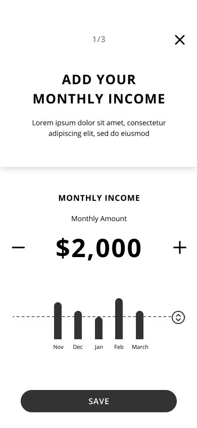
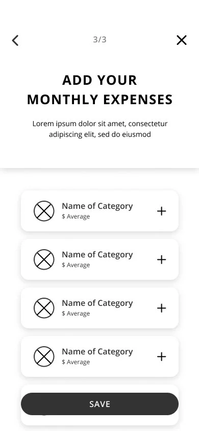
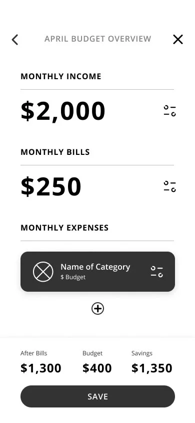
ONBOARDING

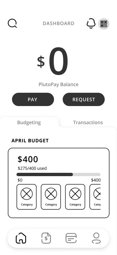
CREATE A BUDGET

REQUEST MONEY

FILTER YOUR TRANSACTIONS
Prototype
•
Prototype
•
Prototype
•
Prototype • Prototype • Prototype •
Mid-Fidelity Prototype
After laying out my low-fidelity screens, I turned them into mid-fidelity wireframes using Figma to get a more detailed version of my app. I also changed a few details when building out these mid-fidelity screens after seeing it more fleshed out. This prototype now has enough information to be able to conduct usability tests.


Usability Testing
•
Usability Testing
•
Usability Testing
•
Usability Testing • Usability Testing • Usability Testing •
Test Report
After collecting and analyzing the data from our 6 usability test sessions, We summarized our observations and insights after collecting the test results through affinity mapping.
Affinity Mapping: The Big Sort
Organized results from all 6 participants into 4 different categories:
Observations
Positive Quotes
Negative Quotes
Errors

Iterations
We are prioritizing 5 important design changes for now to drive iterative improvements for our plutopay app, focusing on the highest severity.
Users...
-
![]()
Weren’t sure what the budget and card icons in the bottom navigation bar represented
(Severity: HIGH)
Change icon to some kind of wallet to let users know that this is their “budget”, this is how much they have in their budget/wallet to spend that month
Revise card icon to look more like a card
Add “Budget” and “Cards” below icon to further clarify what these tabs for, to eliminate any room for confusion
Evidence: 6/6 users didn’t know what the budget icon represented, 5/6 users didn’t know what the card icon represented, 3/6 users didn’t know where to go to create a budget at first
-
![]()
Tried to scroll down to see all transactions at first, instead of using the "expand” icon
(Severity: HIGH)
Change transactions interaction (to see more transactions) to a scroll instead of using expand icon
Get rid of the expand icon
Evidence: 4/6 users tried to scroll down to see more transactions instead of using the “expand” icon, 3/6 users wanted to see more of their transactions without having to click the “expand” icon
-
![]()
Had trouble clicking the “done” and “back” buttons when filtering transactions
(Severity: MEDIUM)
Increase the size of the click area for ”done” and “back buttons”
Evidence: 2/6 users had trouble clicking the “done” and “back” buttons and got a little frustrated thinking that they were doing something wrong
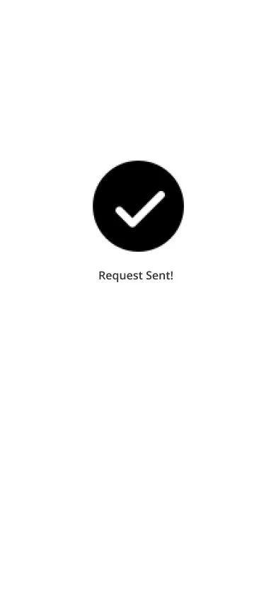
-
![]()
Tried to use the QR Code to request money instead of using the search bar
(Severity: LOW)
Build out QR code feature so that users can use it to request and pay to others in addition to the “Request” and “Pay” buttons
Evidence: 2/6 users tried to use the QR code instead of requesting money by searching someone up since they think it is quicker and easier
-
![]()
Tried to filter by last 7 days by clicking “sort” instead of “dates”
(Severity: LOW)
Get rid of “sort” on the transactions “filter by” page
Add a “sort by” drop down to the main transactions page to make it easier for users to sort, and to further separate “sort by” from “filter by”
Increase size and weight of the filters
Evidence: 1 user tried to filter to see transactions from the page 7 days by going to the “sort” instead of staying on ”filter by” and I had to guide him slightly in the right direction, another user said he thought having ”sort” on the main transaction page might be more efficient and easier to understand


Refine
•
Refine
•
Refine
•
Refine • Refine • Refine •
Design System
After conducting user tests and resolving any identified issues, we proceeded to create a style guide + design system that will serve as a blueprint for plutopay's aesthetic visuals. This guide ensures a smooth handoff process to developers and other designers by providing clear guidelines and instructions for maintaining stylistic consistency throughout the project.

Final Design
After countless iterations and hours of dedication, we arrived at a design that harmoniously blends user-friendliness with accessibility.


NEXT STEPS
I understand that there are always things that can be continuously improved, a design is never perfect. If I had more time or continued working on this project, I would prepare the file and export assets for developer handoff, and work with them to bring plutopay to life! After launching the app, I would conduct more usability testing and surveys to see what can be improved further after being used by real consumers. After going through this design process, I already have ideas on what other features we can implement and improve on such as adding an option to view budgets from previous months.
By continually iterating and refining the design, we can ensure that the app delivers an even more exceptional user experience.
What did I learn?
Throughout this journey, the main thing I learned was that we can't design products just based on assumption. Conducting user surveys and interviews taught me that different people have different needs and goals in life and us designers need to be able to keep accessibility in mind in order to create the smoothest user experience for everyone, no matter their circumstances.
I've gained a lot more confidence after completing this project and I'm looking forward to applying the knowledge I learned to future projects.
Thanks for tuning in!
Excited to collaborate with you! Let's create innovative and captivating digital solutions together.